
When Does it End?
Market Structure Update


Hi everyone, Benjamin here.
Glad to be able to write a quick to note to everyone given the turmoil. With the market throwing everybody a curve ball, I thought it’d be best for us to look at the structure as it stands today.
This will be quick as everything is moving very fast. Ben and myself are running on little sleep in order to stay ahead of this action, and am guessing this applies to many of you as well.
Here’s the quick update in New York minute style.
Funding rates are relatively neutral with more long paying shorts than the other way around. Remember, 0.015 is considered neutral with longs paying shorts.
The means retail is trying to catch a bid when possible and few are willing to ride the short side of a trade still.

But right now, funding rates aren’t a big driving factor.
We know this because the leverage ratio is not supporting this.
In the two charts below we have price in orange fro BTC on top and ETH on the second chart.
The shaded in green area of the chart is open interest. This tells us the amount of positions opened in the market. There’s nothing standing out, thus leveraged trades are not aping in as some suggest.
However, the pink line on top of the shaded green area is rising a lot as of late. This indicates assets on Binance for BTC and ETH are growing. And this is in part responsible for the selling we see on Binance. It’s also leading prices on spot trading at a discount to futures.

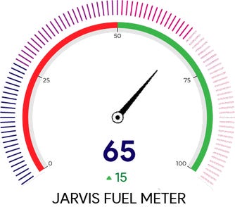
The Fuel Meter got a tip higher thanks to a recent USDT print. It now stands at 65. While I don’t have the number in front me, it’s a signficant jump.
However…
The Risk Meter shot up to 70 after we received bearish stablecoin transactions into the exchanges in past hours. There have been quite a few of these coming through. There’s a handful of ways that a stablecoin inflow can be bearish, we will expand on that soon.

Rising risk means the market is standing on ice and not solid ground. Things can change quickly.
You’re probably sitting there thinking, uh duh. So this really just serves to tell us what we already know.
In terms of what levels of price we can tune into, let’s look at the Feeding Grounds WhaleMap.
These charts show us areas of significance. We do this by pairing up price support and resistances with on-chain flows of significance.
Some of you might recall when Ben Lilly tweeted that the market changed structure after Elon’s tweet.
Well, here’s what he was referring to… If we look back over the last two months, BTC lost all onchain support levels. And it is now trying to find a new support level to build momentum from.
As for ETH, it is hanging in there at a very important level. If it loses it, could get nasty with a ride down to 2600.

You probably already know what’s about to come out of my/our mouth next…
Stick to spot if you’re going to buy or go long. Futures traders, keep sitting tight. We even got another Pablo TX today.
The shit storm is still nasty.
-Benjamin
Love your intel and your chart. Keep up the good work and public service. But every time I look at your funding rate chart, i'm confused. Usually green means positive and red means negative. and the x-axis usually negative on the left and positive on the right. Is it something you created or is it a standard chart annotation?
Gosh! Pablo has so many Bitcoins it's endless