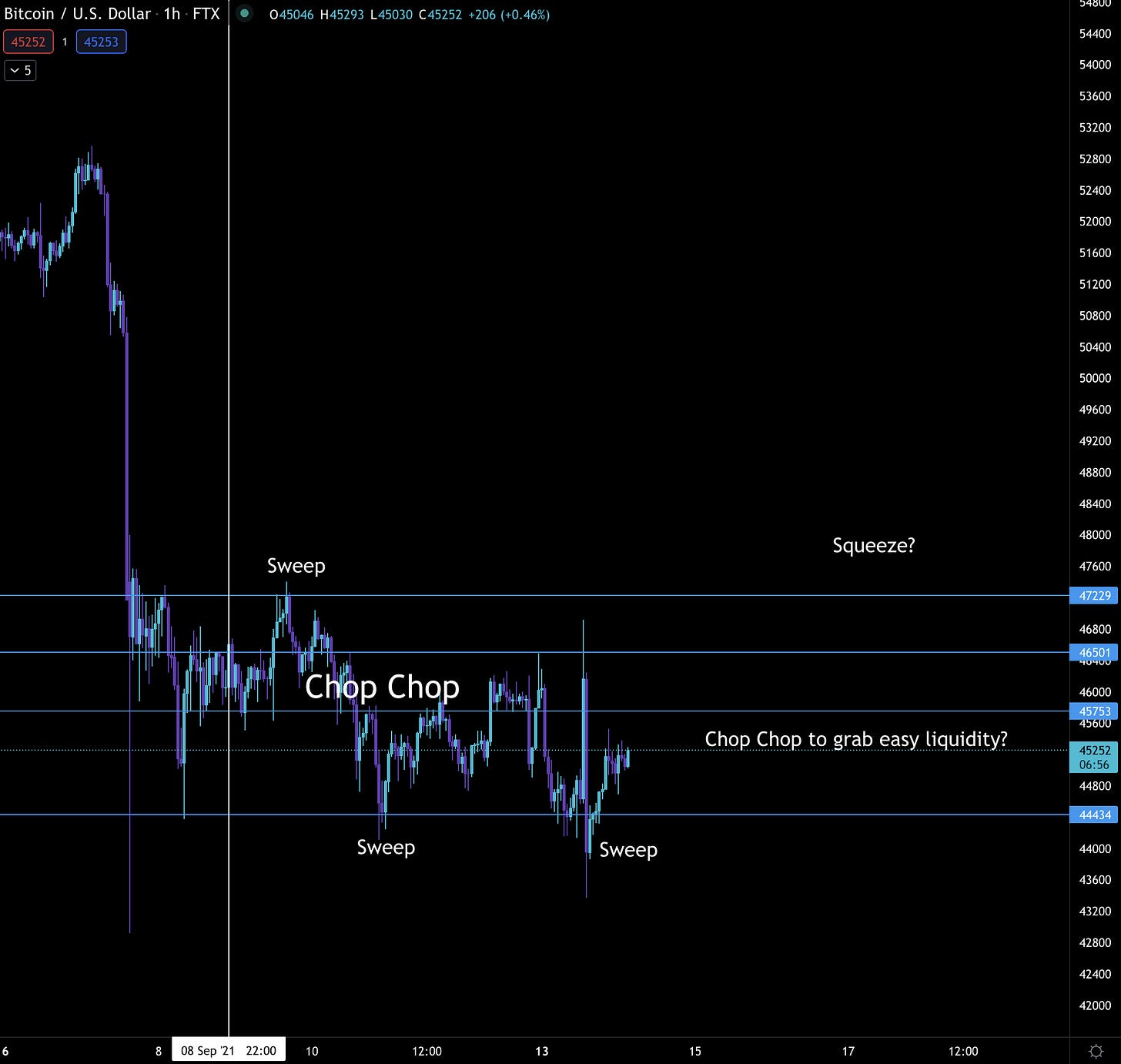
The Chop-Chop
Recent Market Activity
The market bleeds as bitcoin hunts.
Any stop loss thoughtfully placed near recent lows is easy bait.
To make matters worse, any momentum higher is short-lived.
Its frustrating market action at its finest.
Watching price move across the screen draws up images of a twenty-five year old heading home after a night on the town.
chop-chop, chop-chop
This is when traders lose money. It’s over trading and it can leave your wallet dry over time.
To better explain this, the guys over at thekingfisher.io sent over a few charts to our team over the weekend.
For those that don’t know, thekingfisher.io build trading tools. The one today is their liquidation map. It helps traders understand where liquidity resides in terms of price.
It might seem like a weird concept, but the way to think about this is via leveraged trading. If you open up a long position using 10x leverage at $45k, there is a price point below $45k where your position gets closed out at a loss for you.
It’s called being liquidated.
And if somebody decides to push price towards that point, the exchange will sell your position at market prices.
With enough forced liquidations price can move quickly without needing to sell much more bitcoin.
It’s how selling $5 of bitcoin might drop price by $10. And hunting these pools of liquidity make a market mover’s life easier.
In a market that grinds sideways like this, this is the type of trading you can expect. You’ll see a series of fast up or down price movements, followed by some sideways, then another quick move.
It looks like a series of Bart Simpson heads.
But enough of that, let’s get back to the examples. Here’s a chart with September 8th highlighted.
And here’s a chart of thekingfisher.io of the same time period. Note the steepness of the red lines I drew below. The right of the vertical green line - higher price - is steeper than the left. Which means more liquidity higher.
The red box highlights it even more with the series of small bars within it.
So what did price do the following day?
Sweep… Price went on to sweep that price range of liquidity as seen below.
Then once the liquidity was cleared higher, it was time to recalibrate and see how price would move.
Now I don’t have the chart to show for when the actual sweep happened, but we can assume liquidity built up lower… I can make that assumption since we can see the chart just after price dropped $1,000.
It might be hard to see, but below I place a box over the liquidity hanging out just below price. It was much thicker than what existed below.
So what did price do in the chop-chop environment it was in? It went after the liquidity. See chart below.
Then as price hit the next sweep point, here is how the liquidity looked…
This time I kept the boxes the same size so you could see the difference better. I then added a red arrow to point to where the liquidity sat… Higher.
I won’t bore you with the rest. But instead I’ll fast forward to the fun stuff that unfolded recently.
After the chopping around and multiple sweeps, liquidity began to dry up. So as a market mover, this means the $5 creates $10 of price movement isn’t there. Meaning it’s time to create liquidity.
This is the part of a trading range where we often see a “V” selloff, and everybody freaks out.
Don’t be alarmed… This freak helps bring a fresh wave of liquidity with it.
Here’s what the market looked like in terms of liquidity before price whipsawed from $46k to $42k, back to nearly $47k, and then down to $43.3k.
Bone dry.
Unfortunately I don’t have the latest liquidity map to show if liquidity was successfully “engineered”. If I do get a hold of a map, I’ll share on my twitter feed.
Anyways, the point of walking you through all of this is to help explain why this environment is choppy.
Trading in this will be sure to leave your account chopped up. Remember, it’s all about capital preservation.
Now, looking forward there are really two scenarios we are tracking.
The first is a scenario that shows this sideways movement continuing. It means more choppiness over the coming weeks. This a fractal from July 2021 placed over a recent chart of bitcoin.
In this environment you can look to scale into position via spot. Leveraged trading is nothing to get excited about here.
And this scenario is currently the one we are leaning towards. Meaning we think a retest of $42kish might be in the cards.
The other scenario we are tracking is the one below. It’s a fractal of late-2020 to the selloff in April/May 2021.
This type of price action would be vicious. It will create a lot of liquidity lower very fast. It’s often times known as exit liquidity before it happens… Let’s hope this isn’t in the cards.
Unfortunately, Substack is telling me my post is too long, likely too many charts. So I’ll end it here and follow up again soon with some in-house metrics.
Until next time…
Your Pulse on Crypto,
Ben Lilly


Thanks for another great insight!!
Thank you. Recently alts stated recovering less even when BTC did go up. Having bought 'the dip' did indeed leave the wallet dry, with a prospect of the markets going lower. How come alts become more bearish than Bitcoin, when just a few days ago it was the other way around? Maybe you have some insight on that.